Reliable
A calm foundation for high-context business communication.
01 · The brief
iLarkimas Innovations develops digital software and enterprise solutions, with a specialization in core banking. Its work belongs behind the services people use every day: complex systems that need to be understood, trusted and maintained over time.
The branding challenge was to give that technical expertise a recognizable expression. The identity needed to work in a proposal, on a software presentation and across a physical workplace, while balancing the confidence expected in banking with the energy of a technology company.
The original visual identity guideline, dated May 2024, provides the foundation for this case study. The architectural, workplace and communication scenes extend that documented system into proposed applications.
02 · Brand strategy
A banking technology provider speaks to several audiences: business leaders evaluating a partner, technical teams assessing a system and employees delivering the work. The same brand needs to feel credible in each conversation without becoming visually anonymous.
The design approach combines a stable dark foundation with a more expressive graphic layer. Controlled contrast and disciplined layouts carry information; the symbol and violet accents provide recognition. The resulting language is intended to balance technical confidence with an approachable visual presence.
A calm foundation for high-context business communication.
Consistent proportions, readable hierarchy and controlled placement.
One recognizable language across documents, screens and spaces.
03 · The central idea
The supplied brandbook describes a thunderbolt-inspired symbol and a creative narrative connecting power, saffron and cultural heritage. The case study follows that creative narrative as the starting point for the visual system.
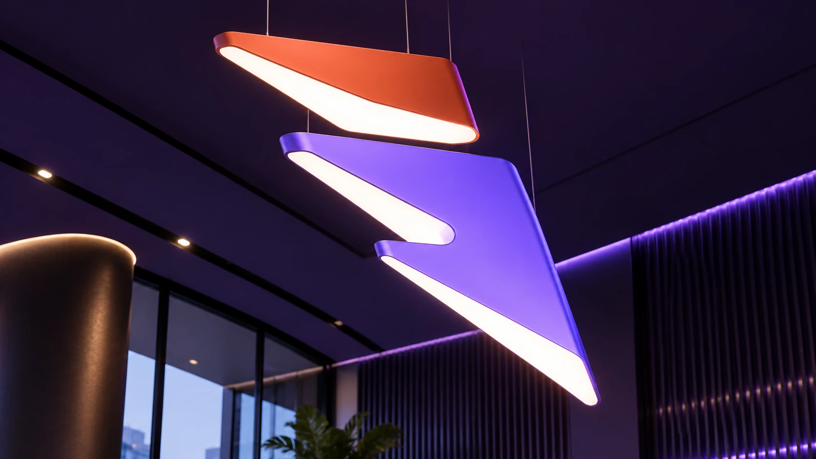
Visually, the useful idea is the relationship between the two parts: a curved upper form and an angular lower form, separated by deliberate negative space. Coral and lavender distinguish the pieces; together they produce a compact signature that can also expand into a much larger composition.

From the original identity guideline
04 · A bilingual signature
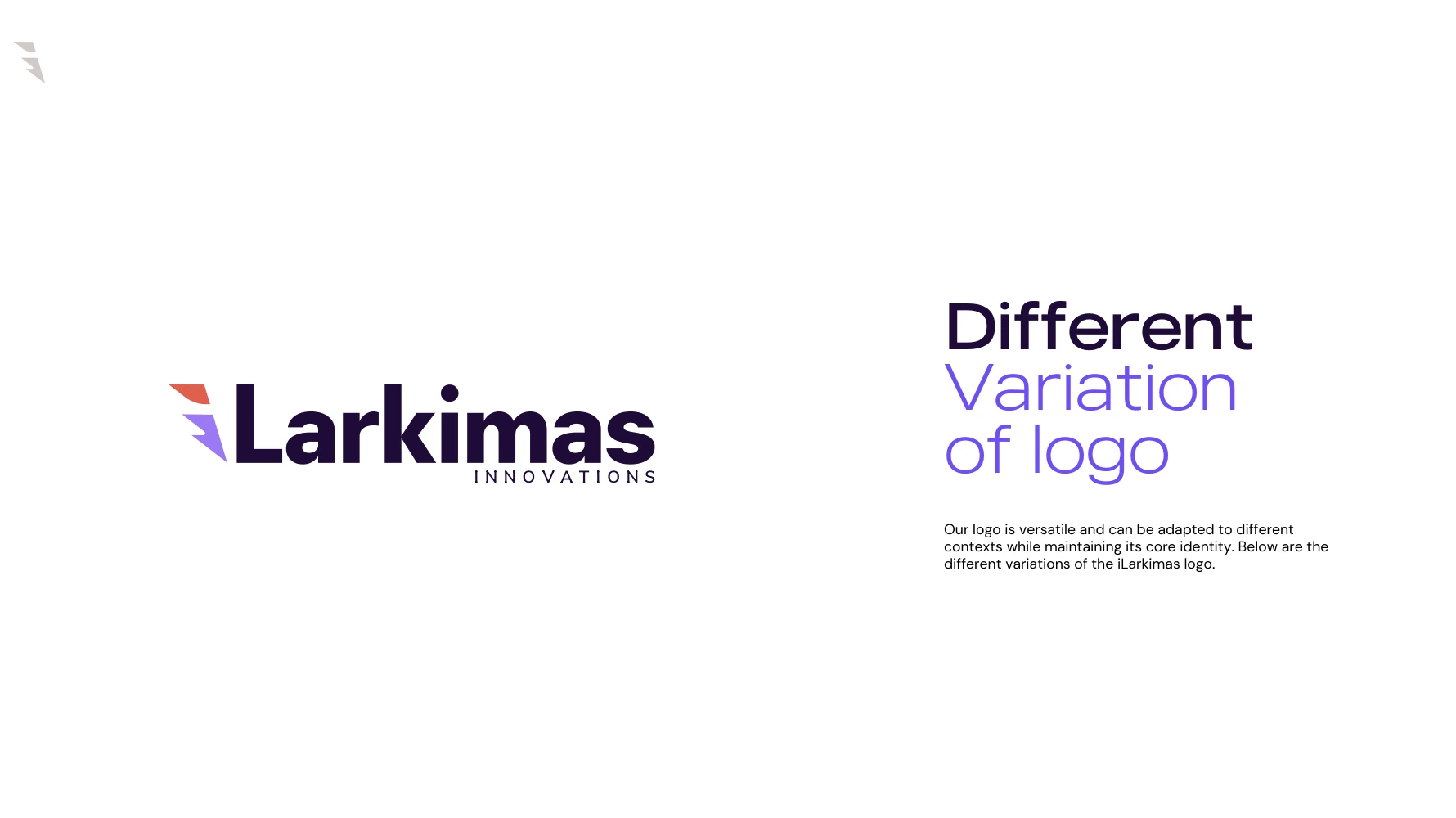
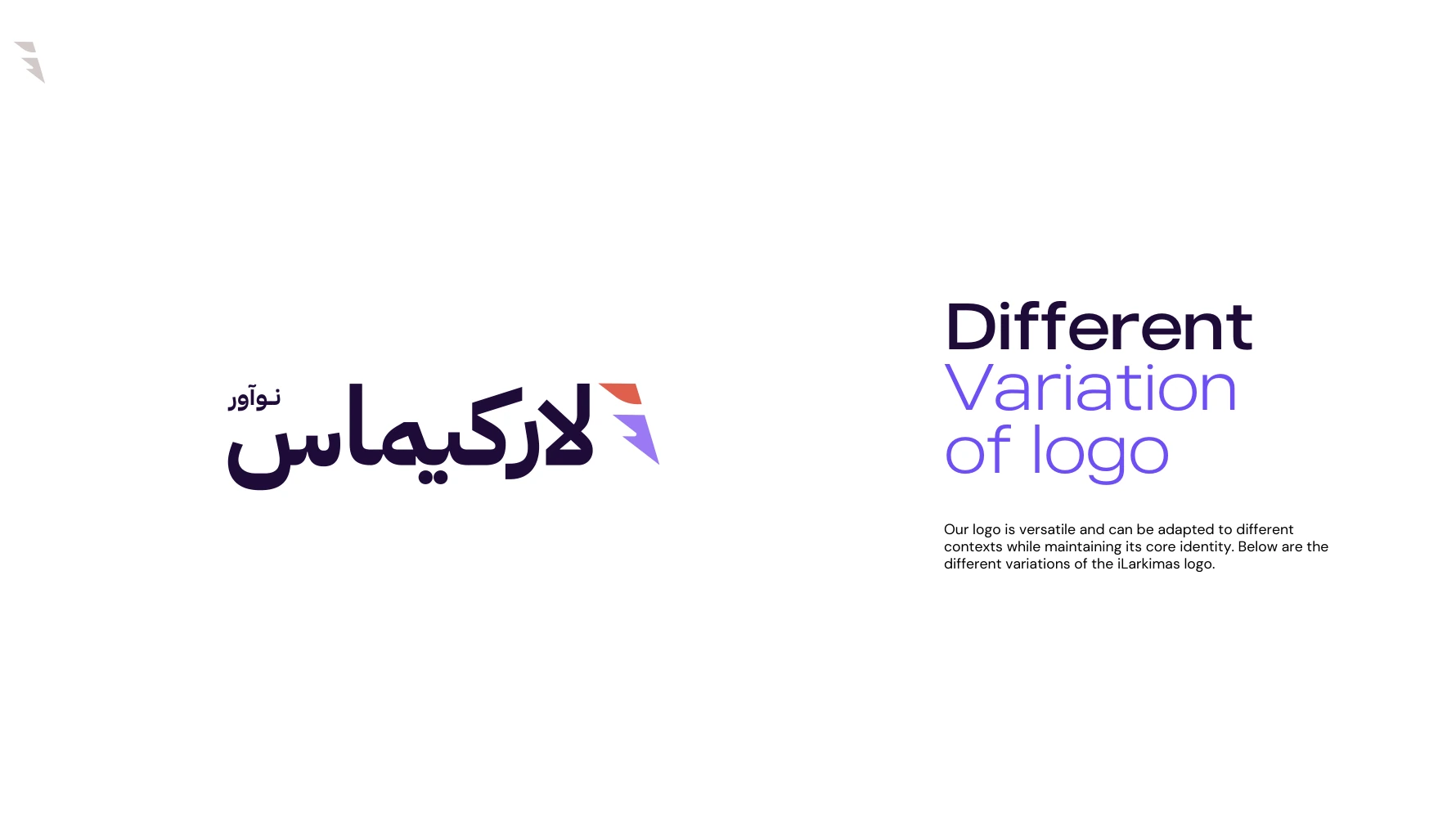
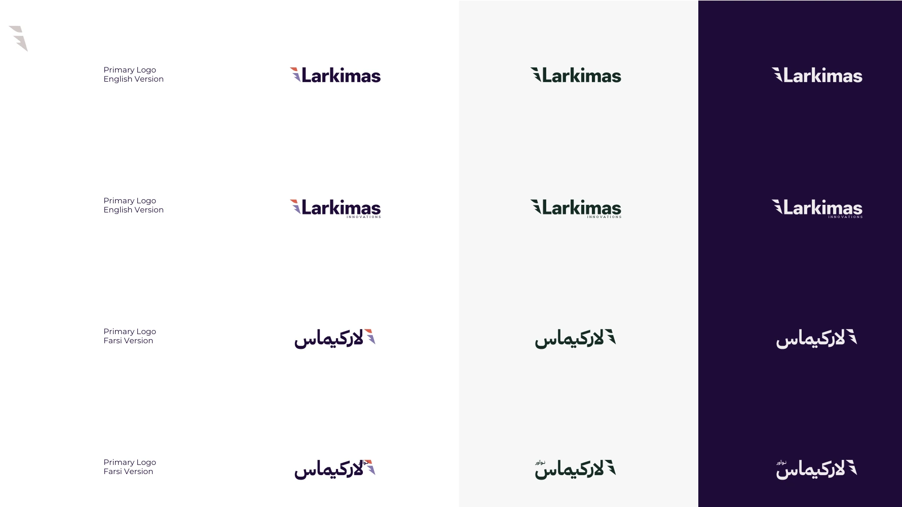
The identity includes English and Persian wordmarks alongside a standalone symbol. The original vector artwork is retained so that the shape, proportions and relationship between the mark and the name remain consistent.
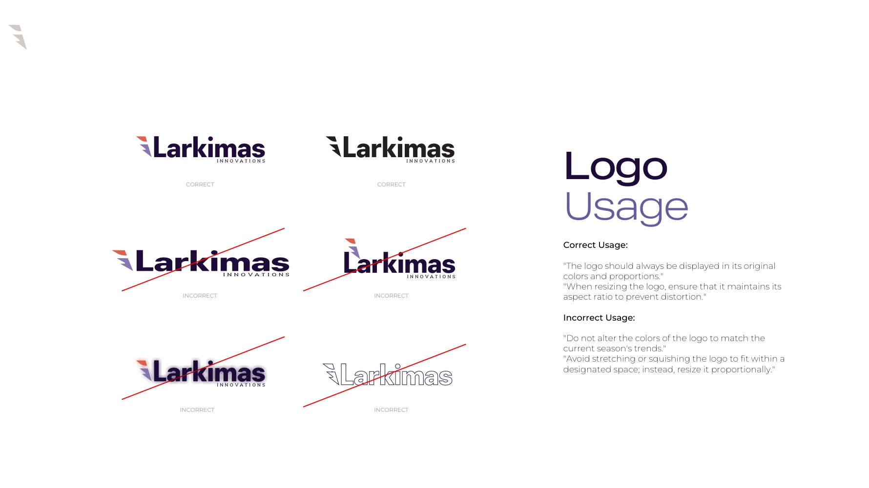
The system includes light and dark versions for different backgrounds. A strong logo application depends on more than placing a mark: contrast, clear space, scale and the surrounding content all determine whether it remains readable. The wordmark should scale proportionally, rather than be stretched to fill a surface.
From the original identity guideline
05 · A controlled spectrum
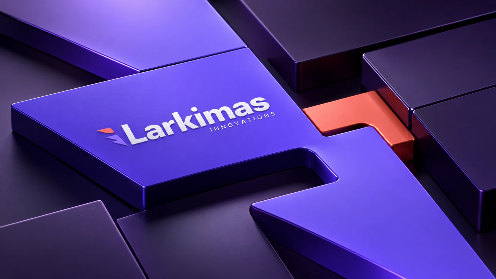
Deep aubergine creates the central brand atmosphere. Vivid violet brings energy to large graphic surfaces, while lavender and coral distinguish the two-part symbol. White and black create a practical foundation for documents, signage and everyday communication.
The RGB guideline also introduces softer violet, peach and green tones. These extend the palette without requiring every application to use every color. In the new scenes, color is concentrated at meaningful points: a reception wall, a directional panel, a document cover or a single architectural detail.
06 · Typography and information
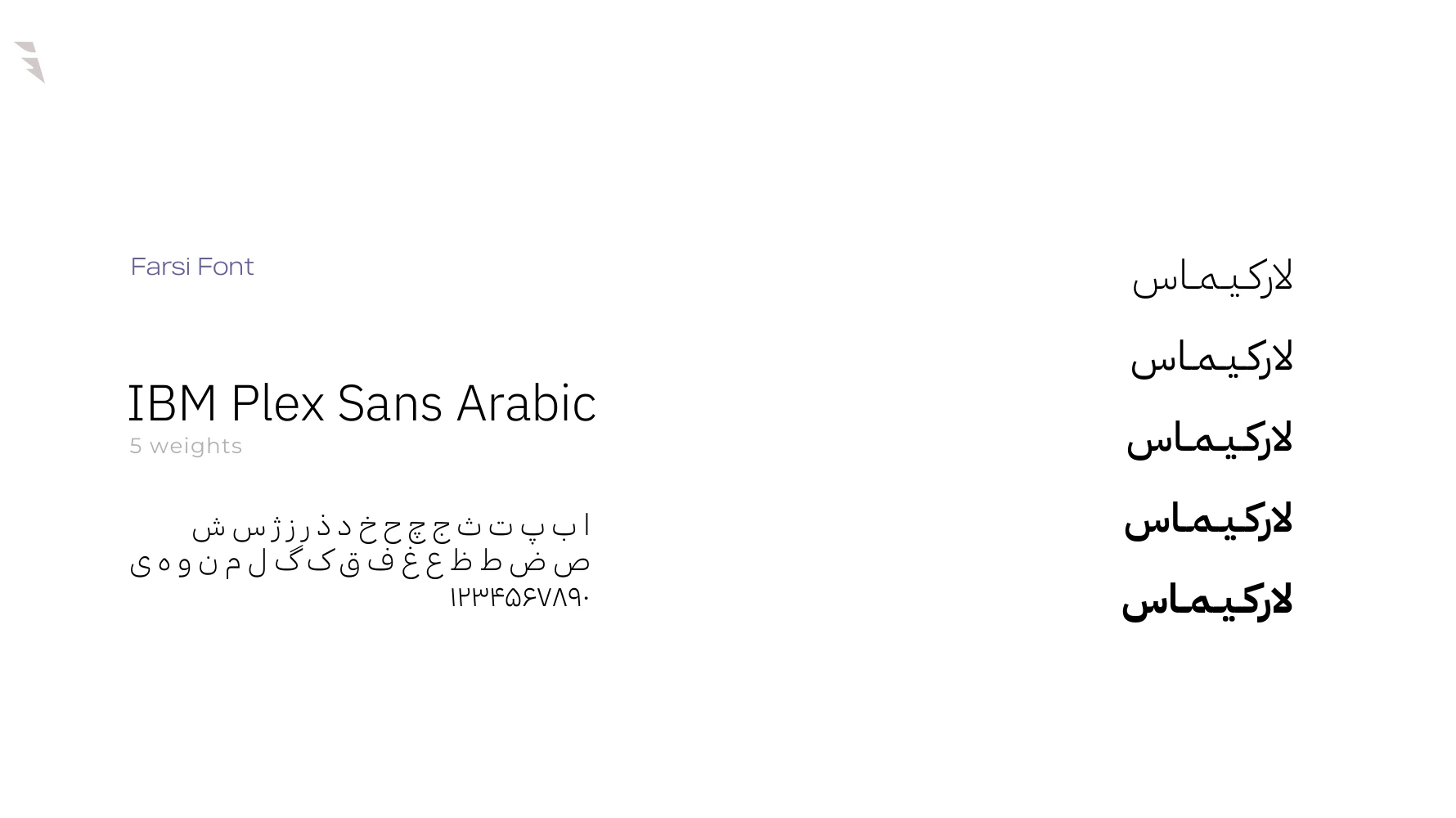
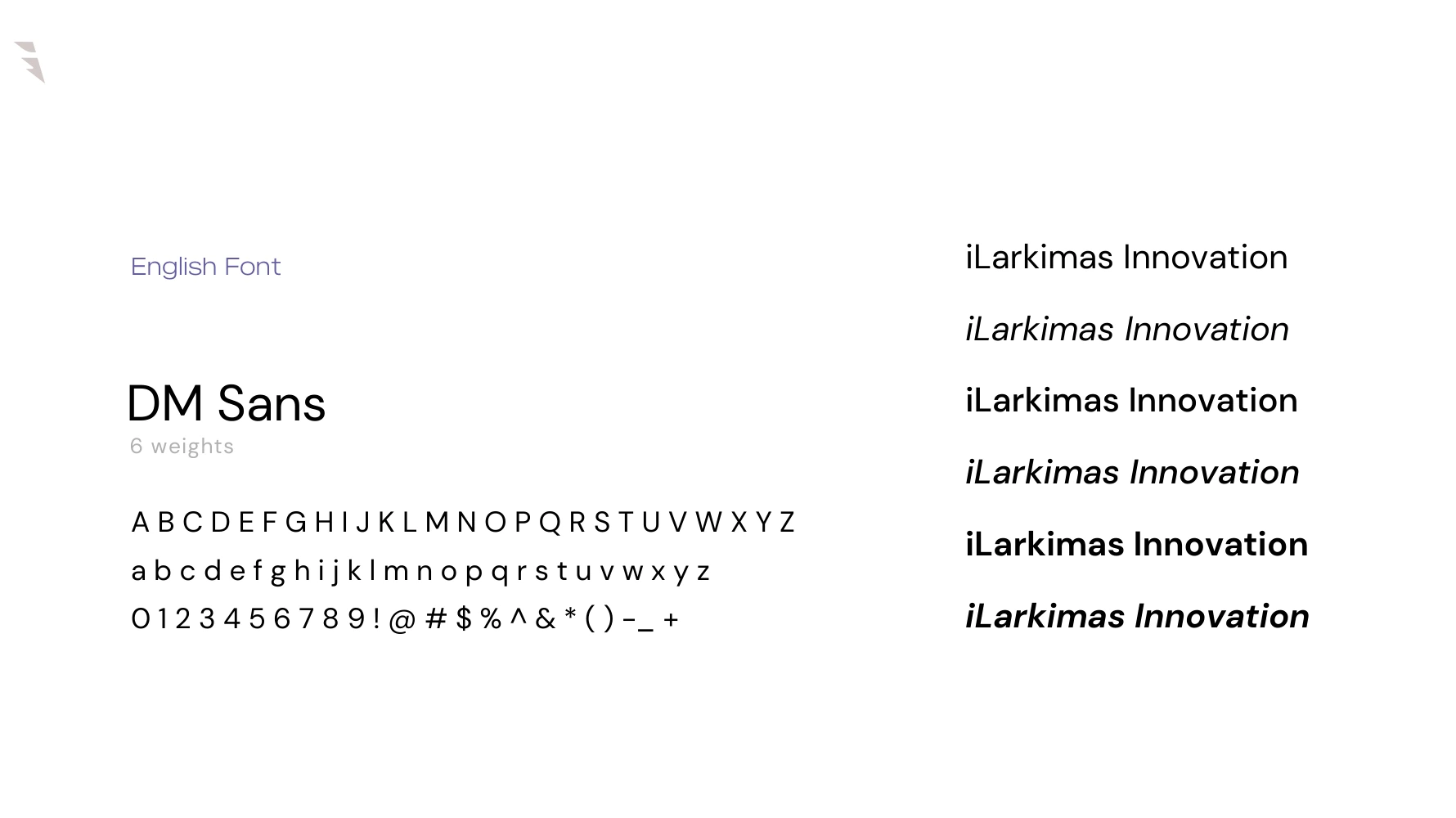
The original guideline pairs DM Sans for English with IBM Plex Sans Arabic for Persian. Their role in the brand is functional as well as visual: they organize information, distinguish levels of hierarchy and keep detailed business material approachable.
The case study follows the portfolio’s established typography, including Vazirmatn for Persian website text. The original font choices remain visible in the guideline samples. Across applications, the principle is consistent: strong headings, quiet supporting information and enough space for both to be read comfortably.
From the original identity guideline
07 · Beyond the logo
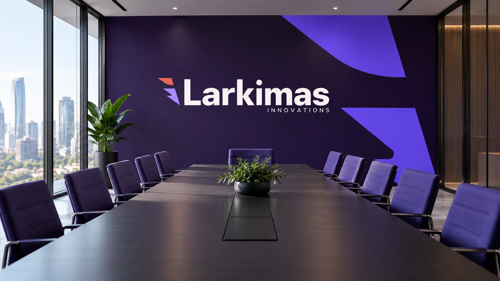
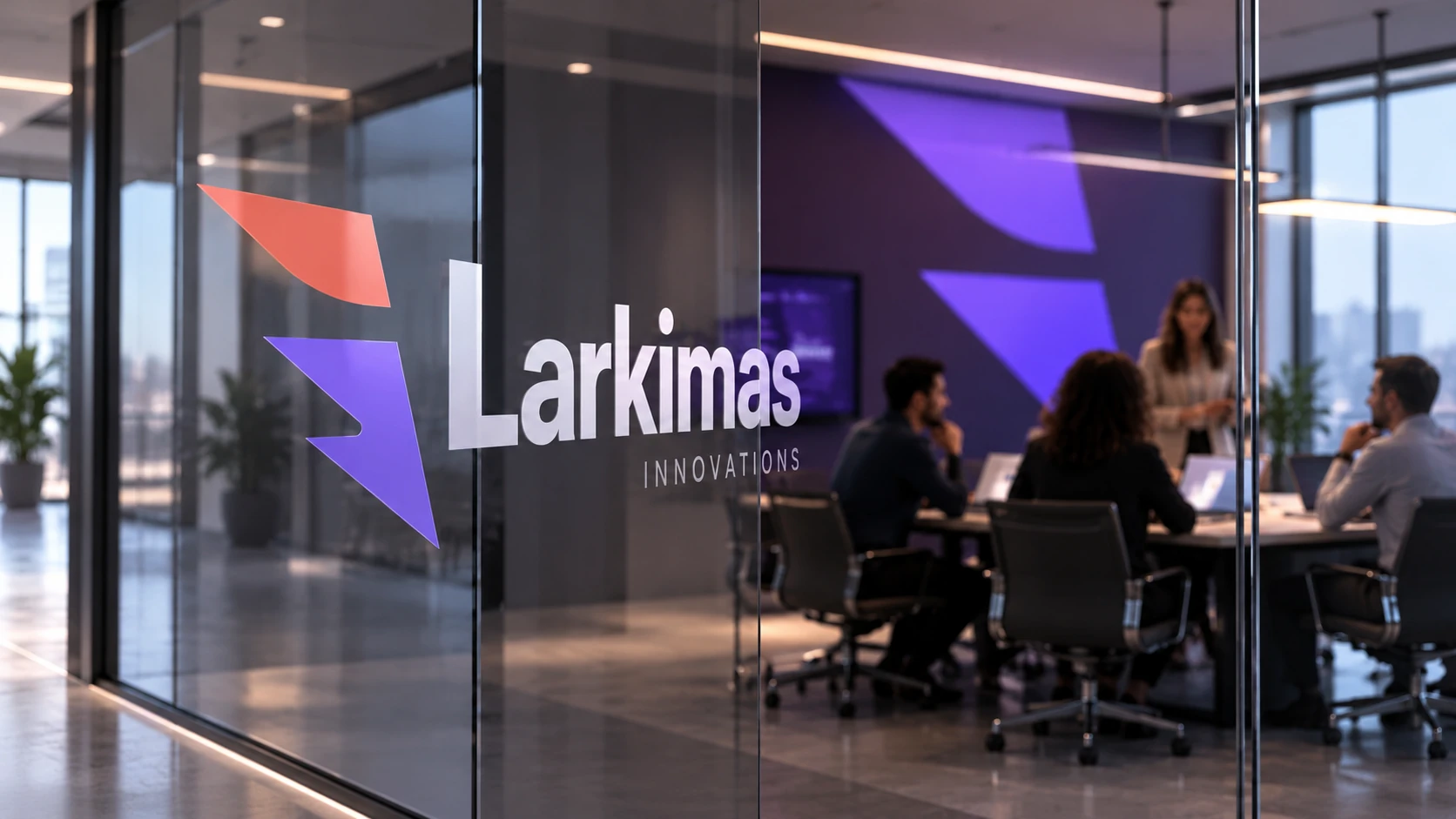
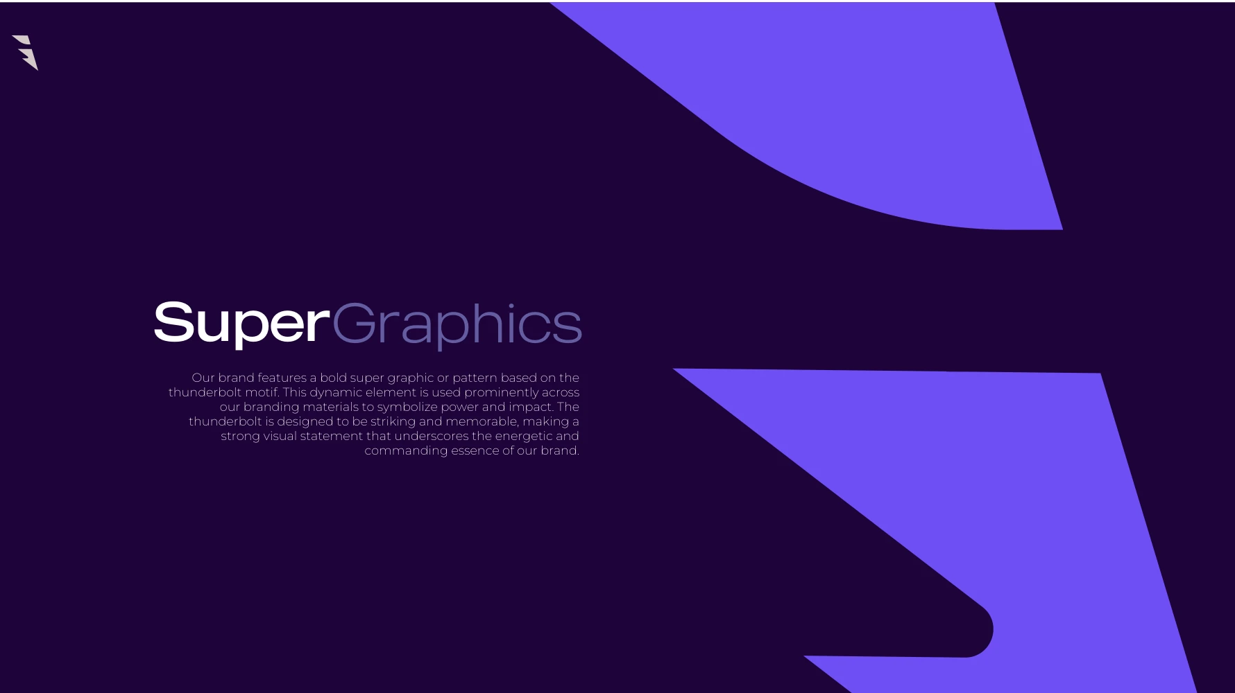
The thunderbolt becomes a supergraphic through scale, cropping and repetition. Its curved edge softens large fields of color; its diagonal geometry introduces direction. This allows a surface to feel recognizably iLarkimas even when the full wordmark is small.
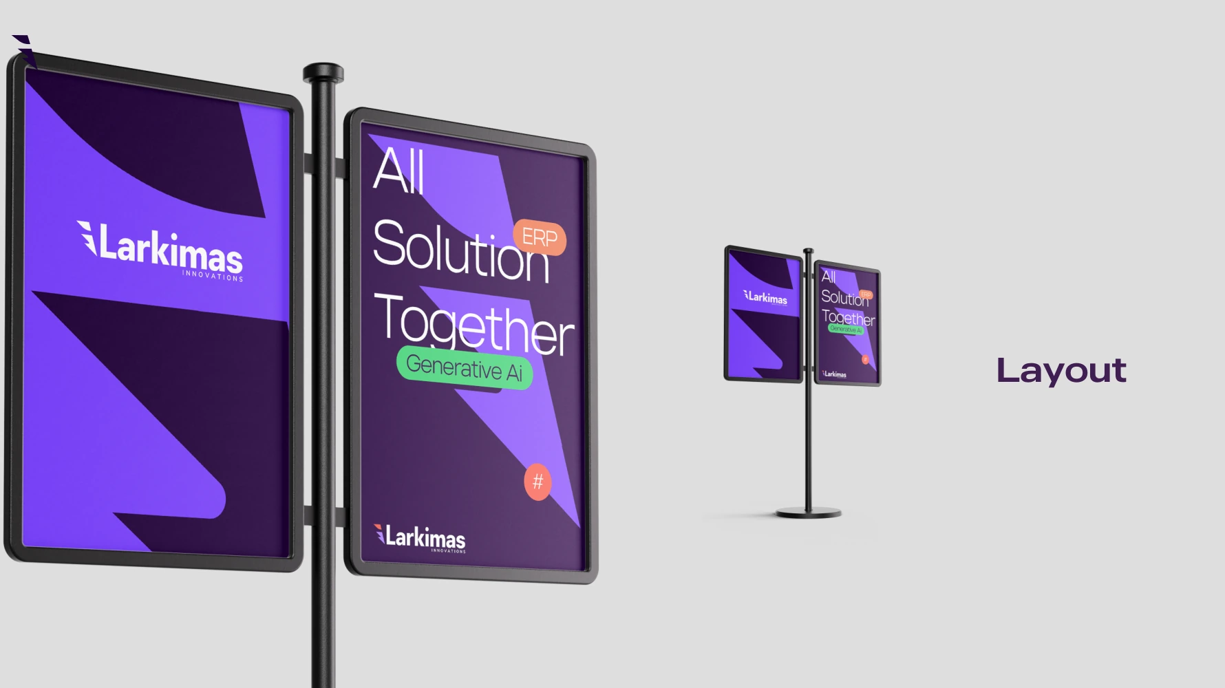
The same approach can travel from stationery to a presentation backdrop or glass partition. The aim is controlled variation: enough flexibility to create a family of applications, with enough consistency to keep them connected.
From the original identity guideline
08 · A workplace that carries the brand
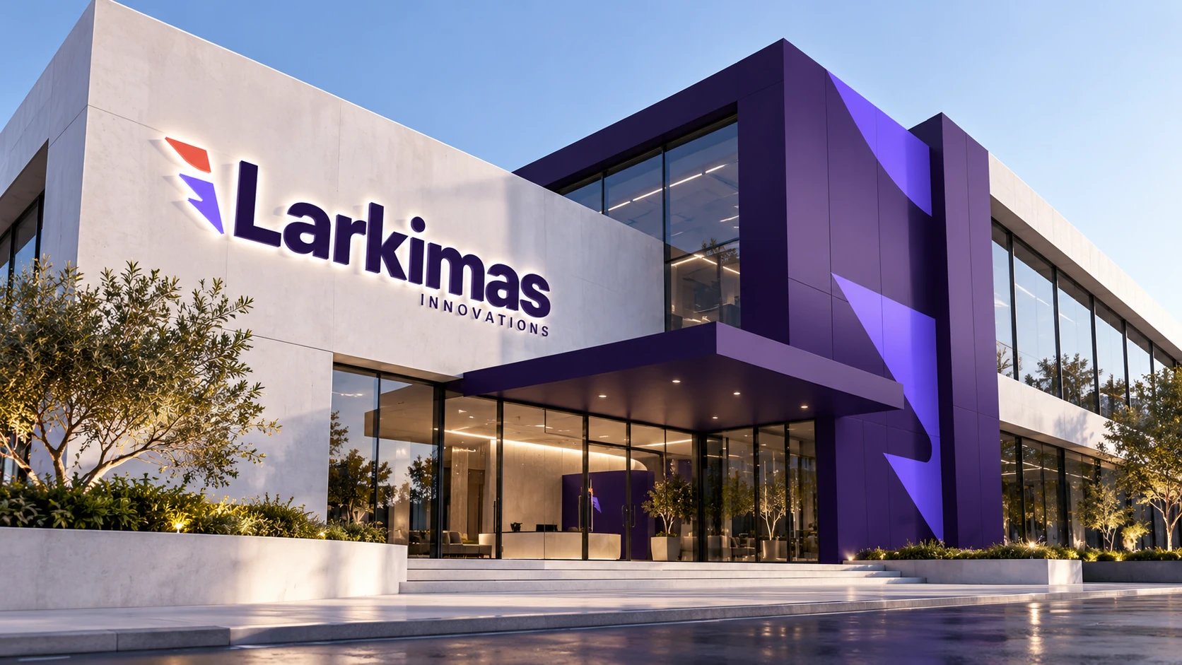
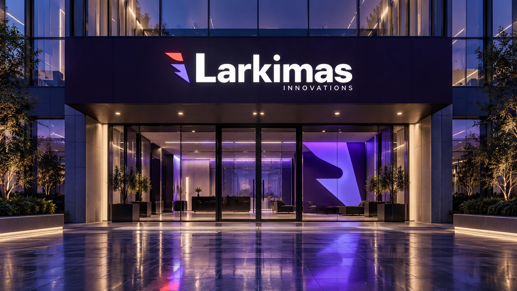
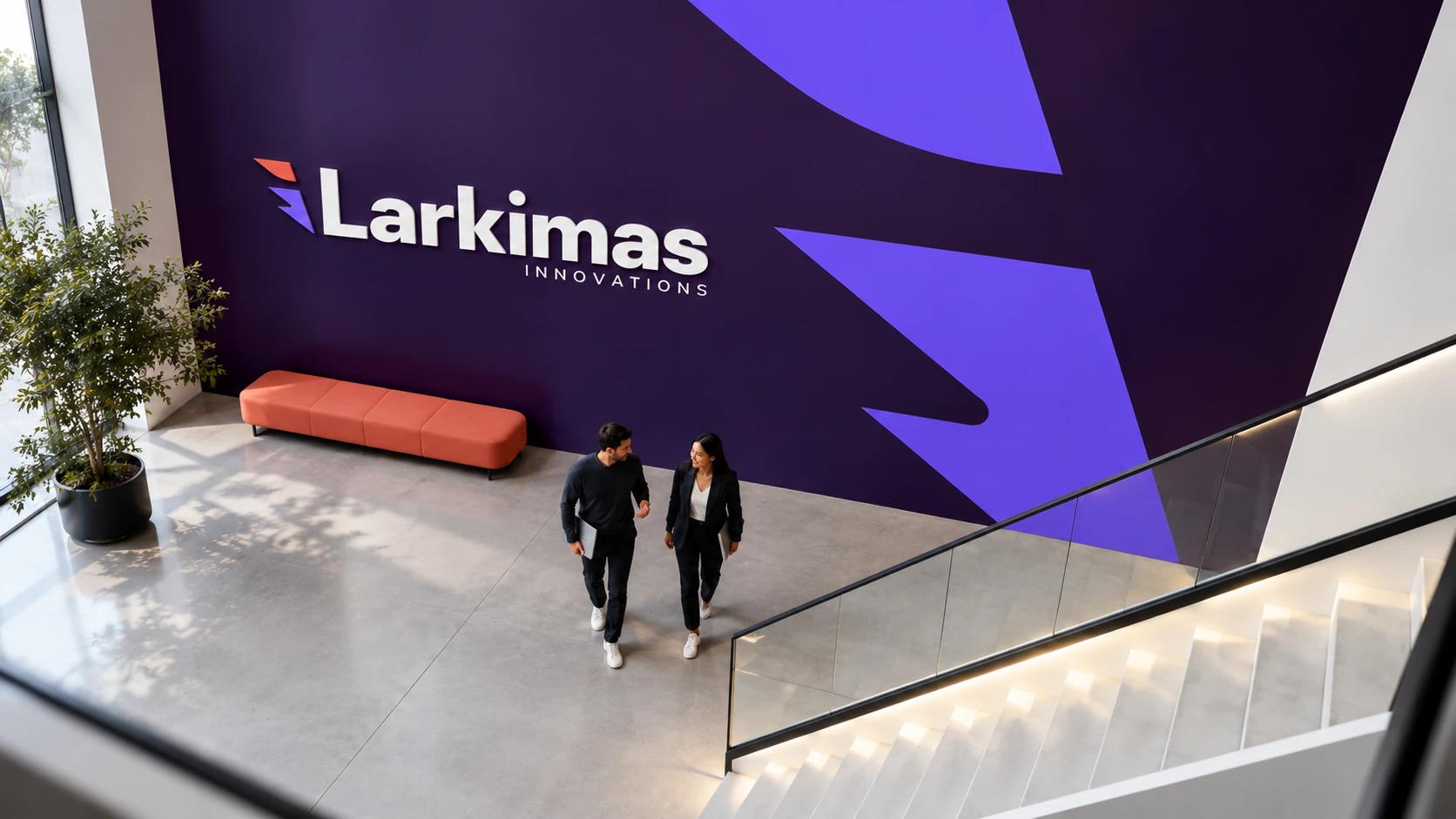
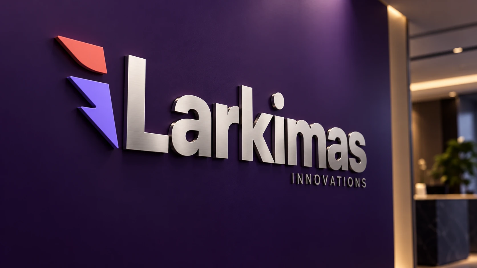
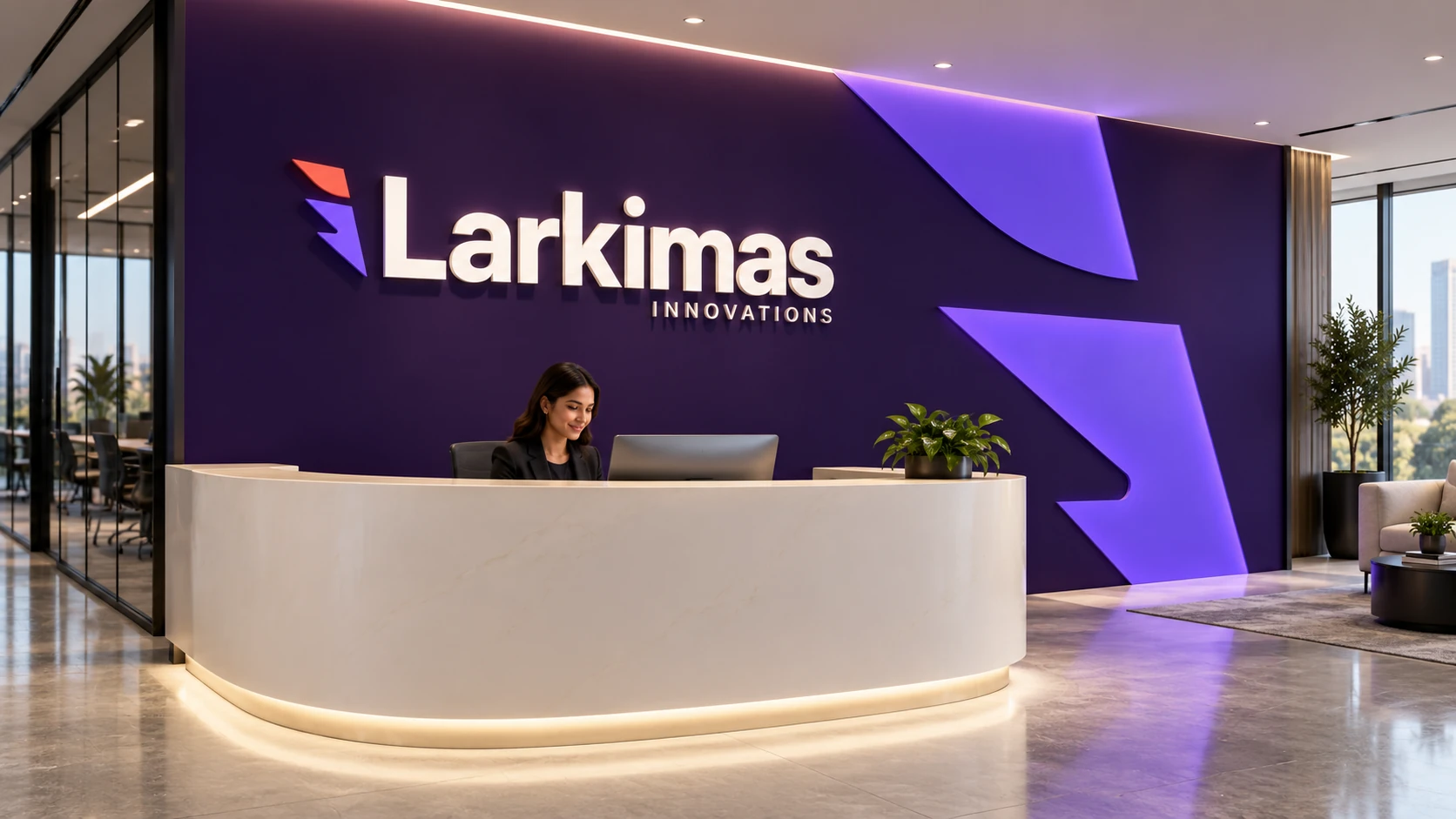
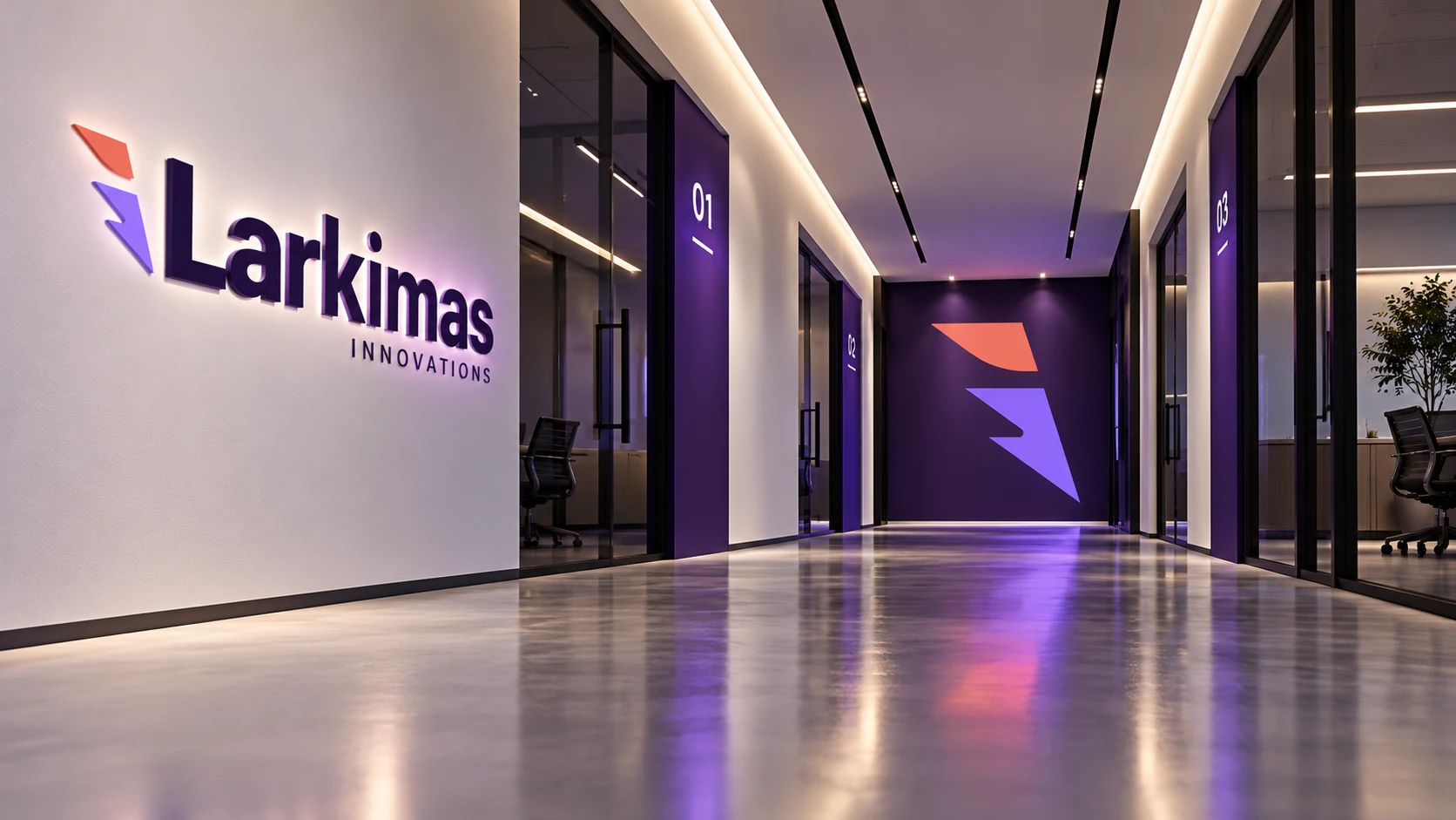
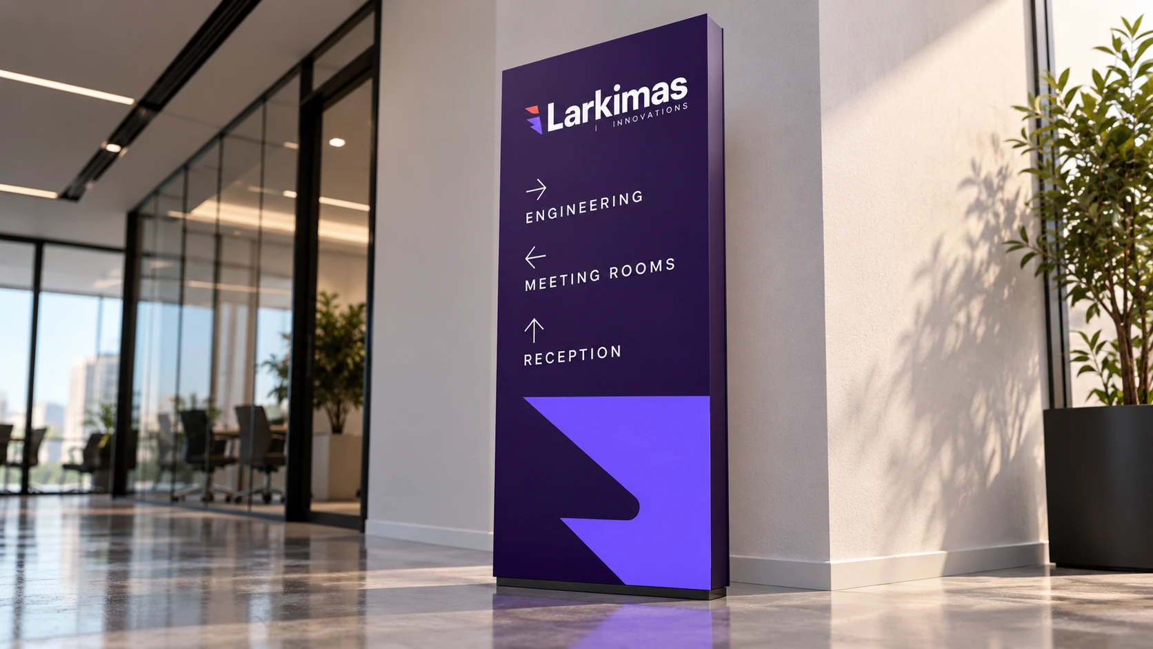
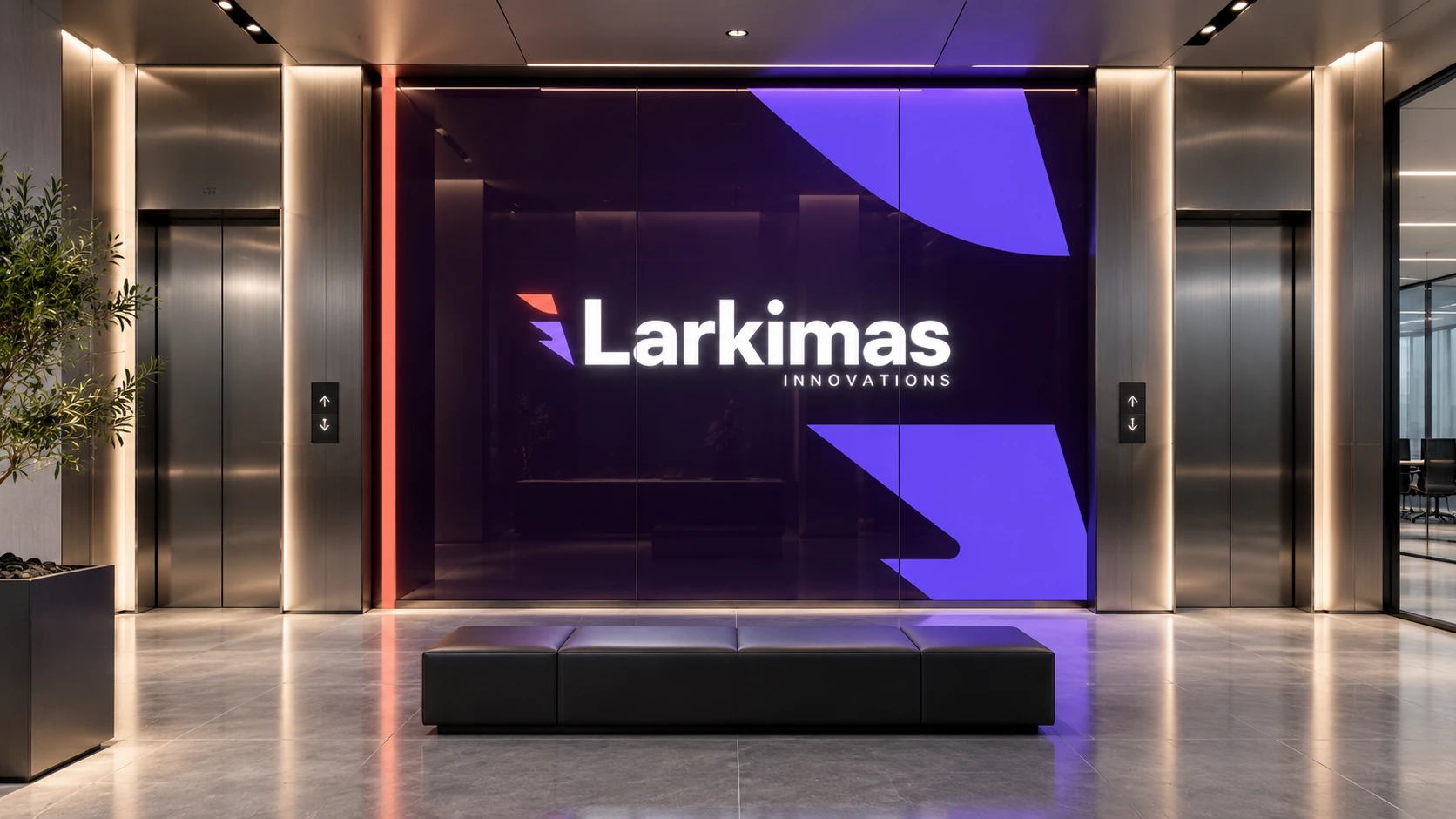
The spatial studies translate the identity into an arrival sequence: a recognizable building, a clear reception point, a legible route and a quieter place to meet. Brand color establishes landmarks instead of covering every surface.
Aubergine and violet define selected walls and signs; white, glass and restrained metal give the workplace room to breathe. Different camera positions reveal the system at different scales, from a facade and atrium to a door graphic and a directory.
These are proposed architectural and environmental applications. They illustrate how the identity could be implemented; they are not photographs of completed iLarkimas facilities.
09 · The people behind the software
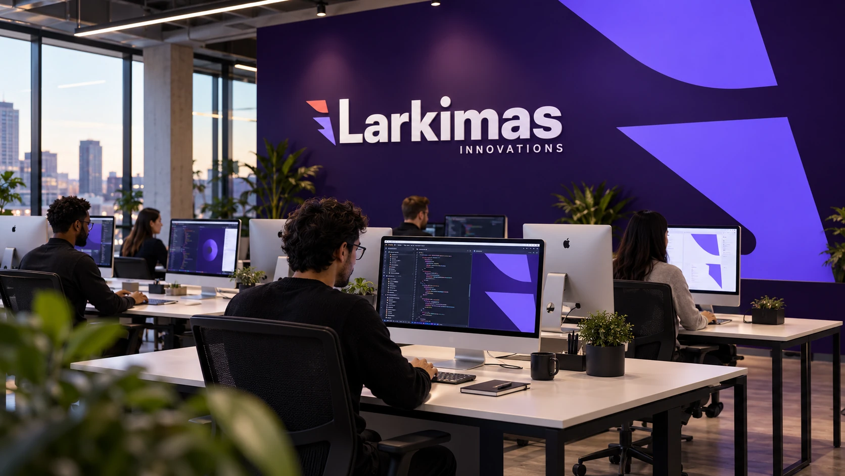
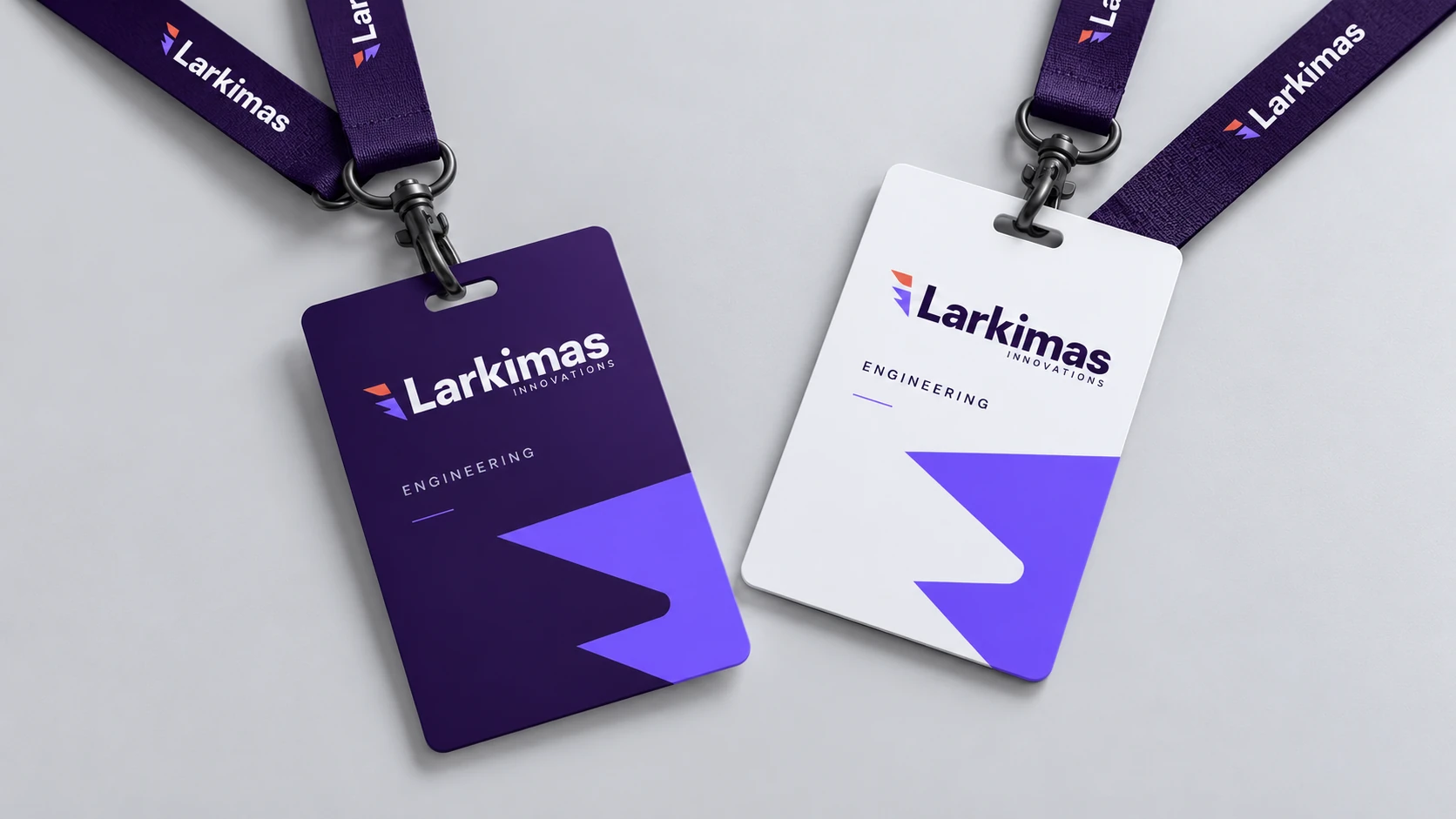
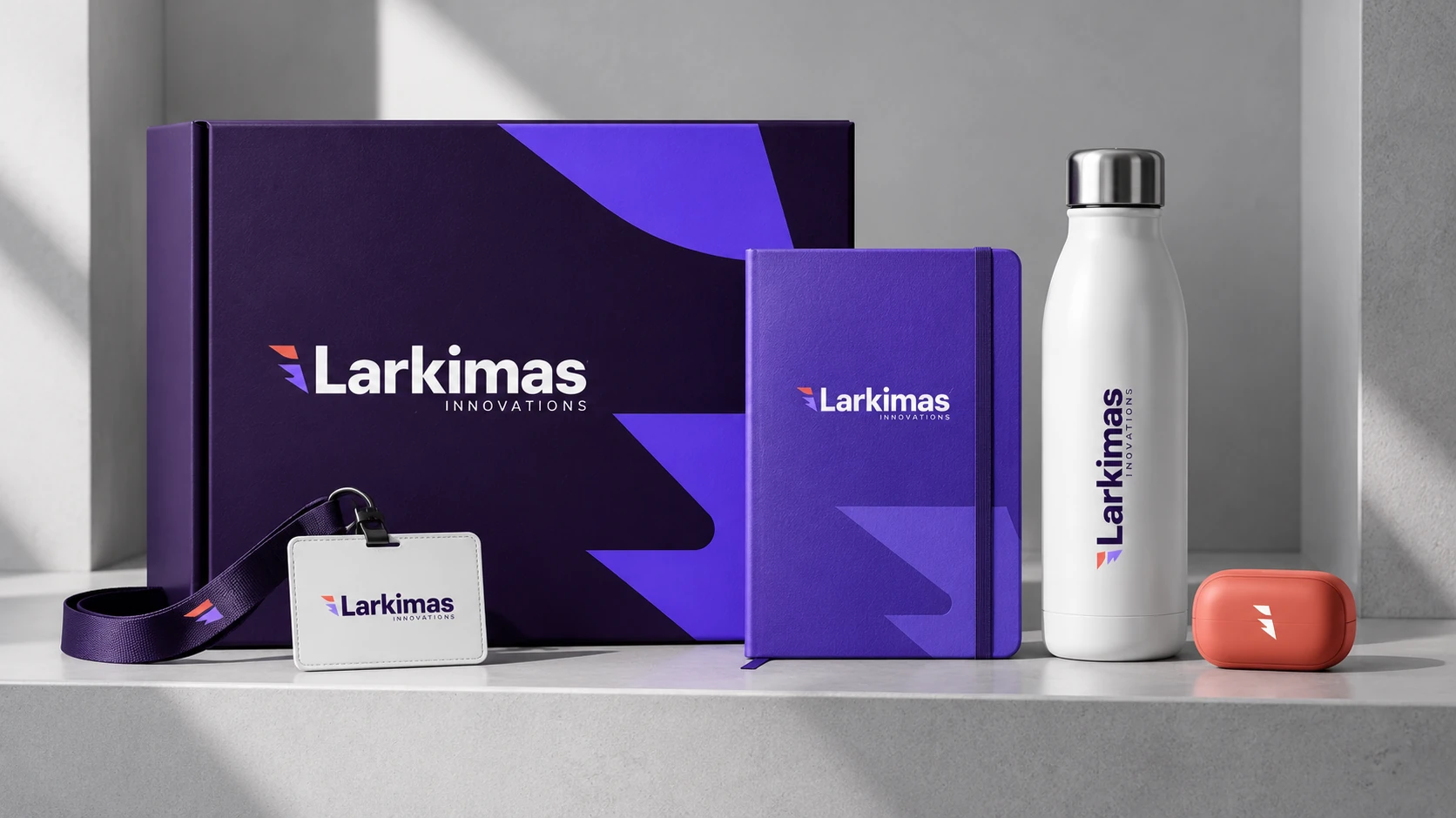
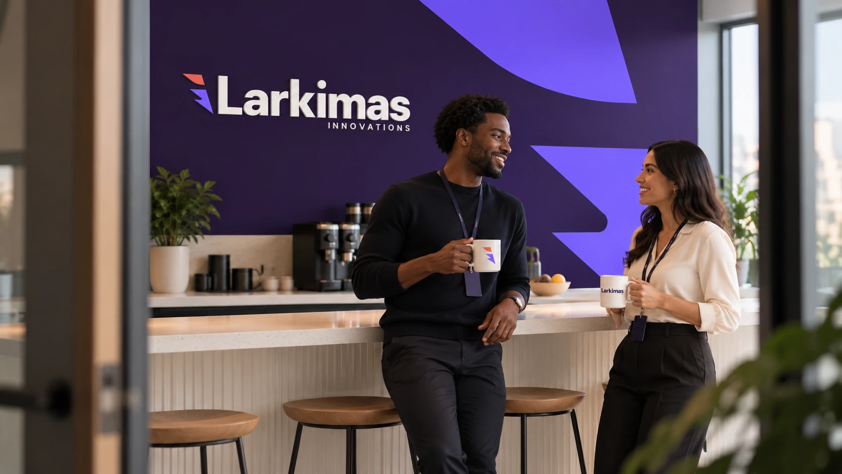
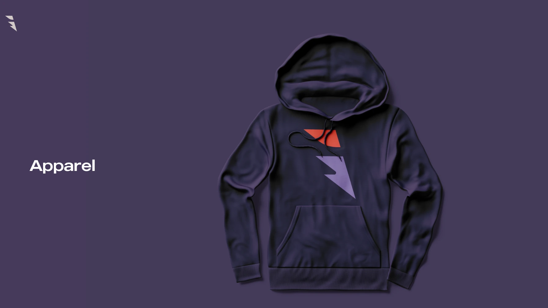
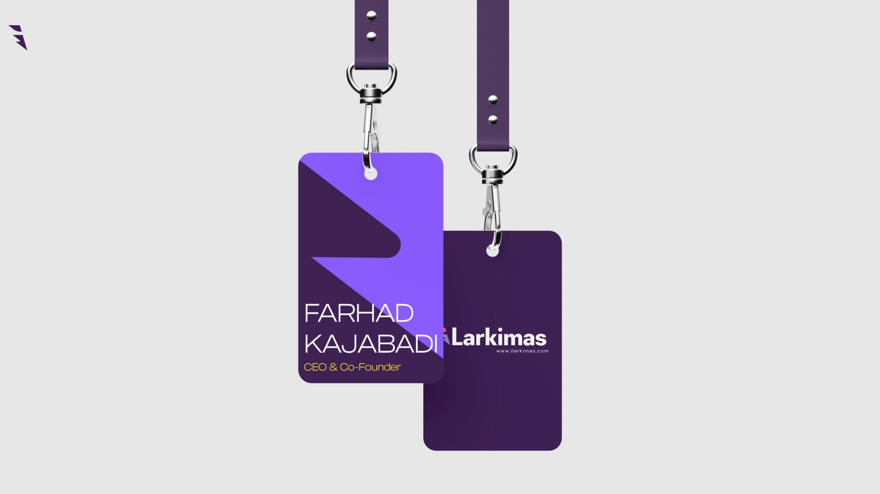
The brand also appears in the moments that belong to a team: arriving at a desk, joining a meeting or receiving a welcome kit. Clothing, identification and shared spaces provide a quieter expression than a large reception sign.
The applications favor small marks, purposeful color and consistent placement. The identity supports the people in the scene without turning the workplace into an advertisement.

From the original identity guideline
10 · The working identity
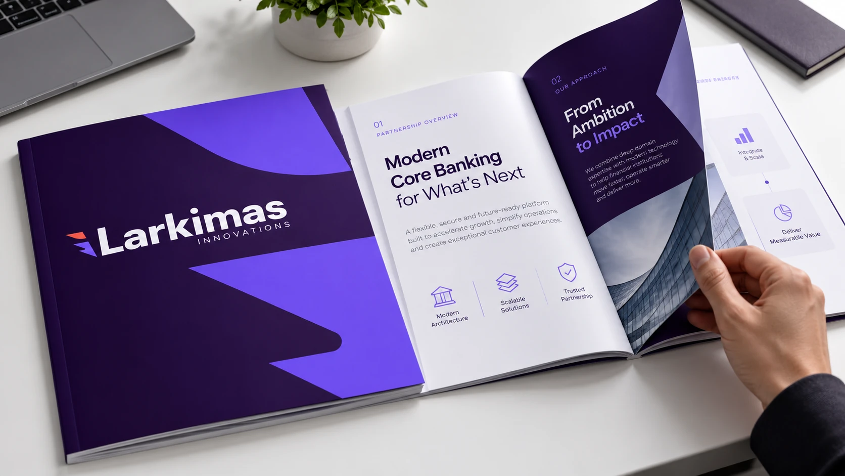
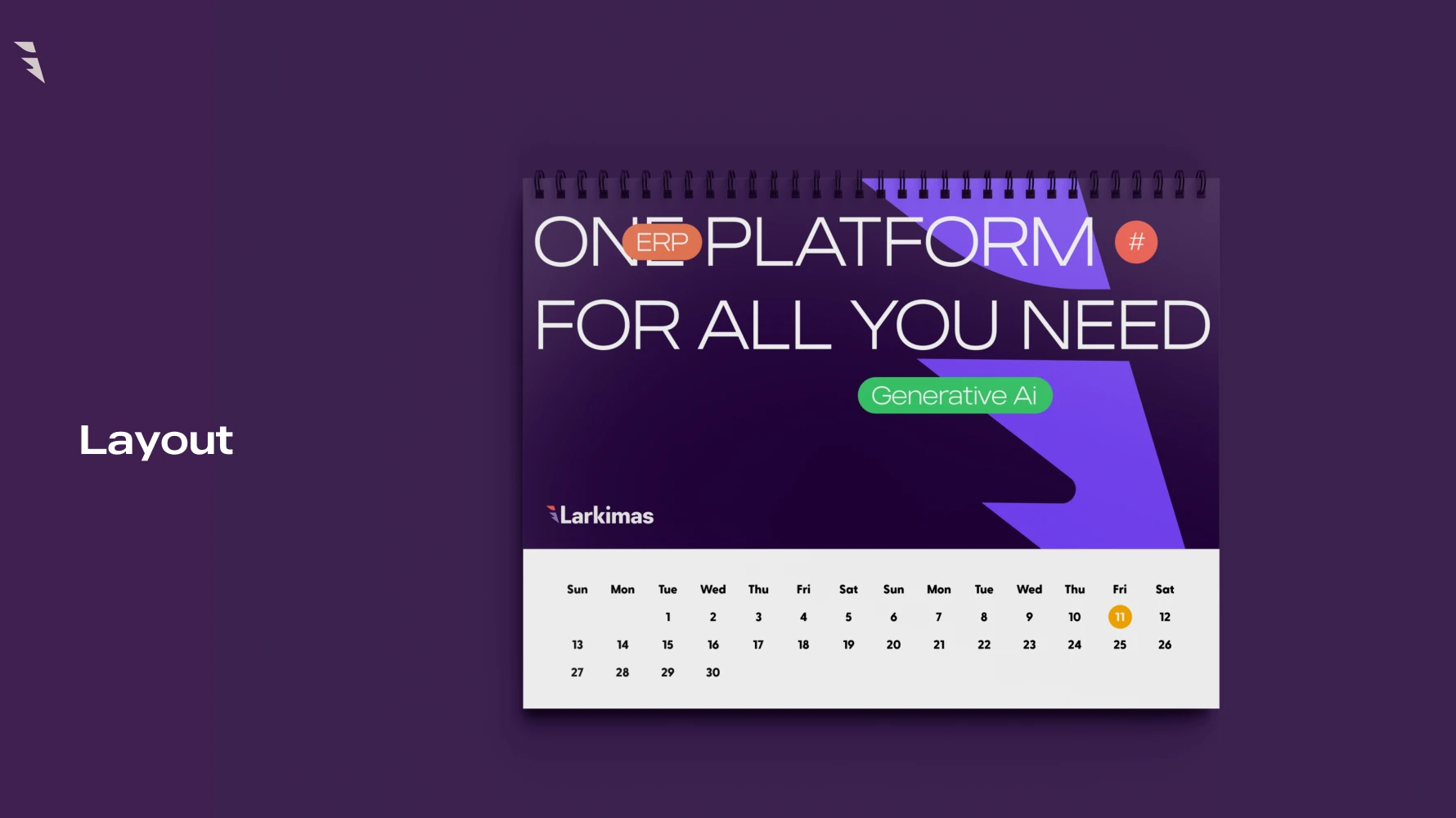
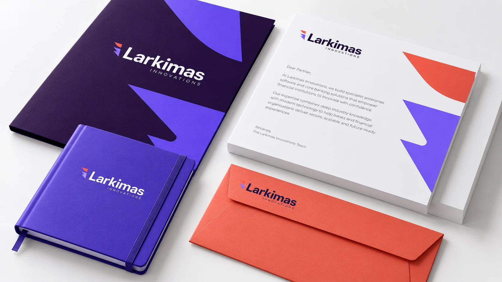
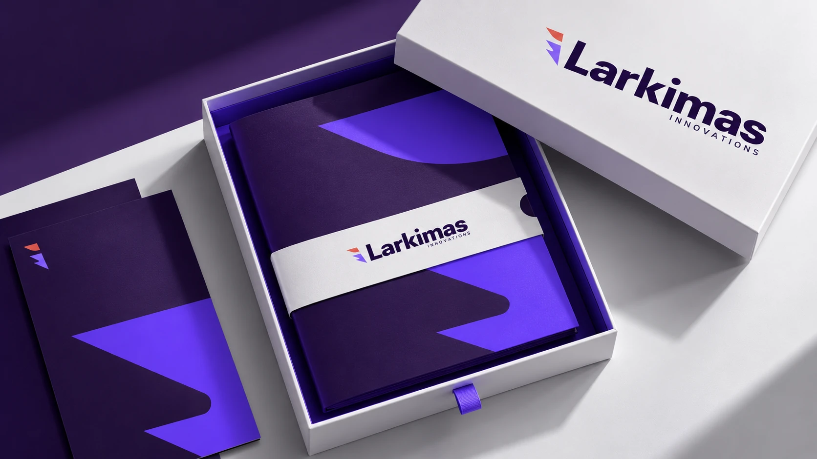
The original guideline extends the identity through letterheads, envelopes, folders, business cards, identification and branded materials. These are important interfaces for a solution provider: the brand often reaches a prospective partner through a document before it reaches them through a building.
The expanded studies apply the same hierarchy to proposals, onboarding materials and delivery packaging. The mark establishes authorship, the supergraphic connects the set and the layout keeps the content usable. The new studies use sample content to show the hierarchy and application of the visual system.
11 · A brand for a software business
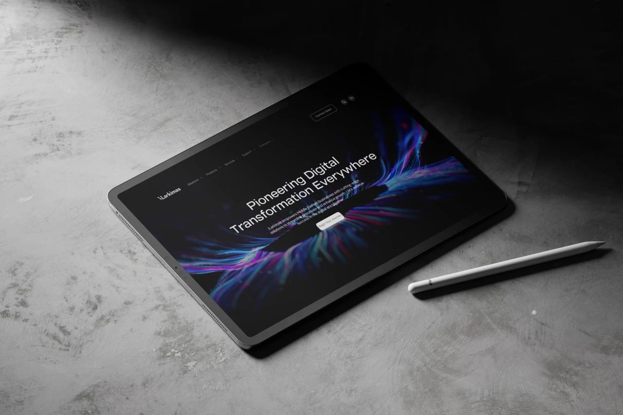
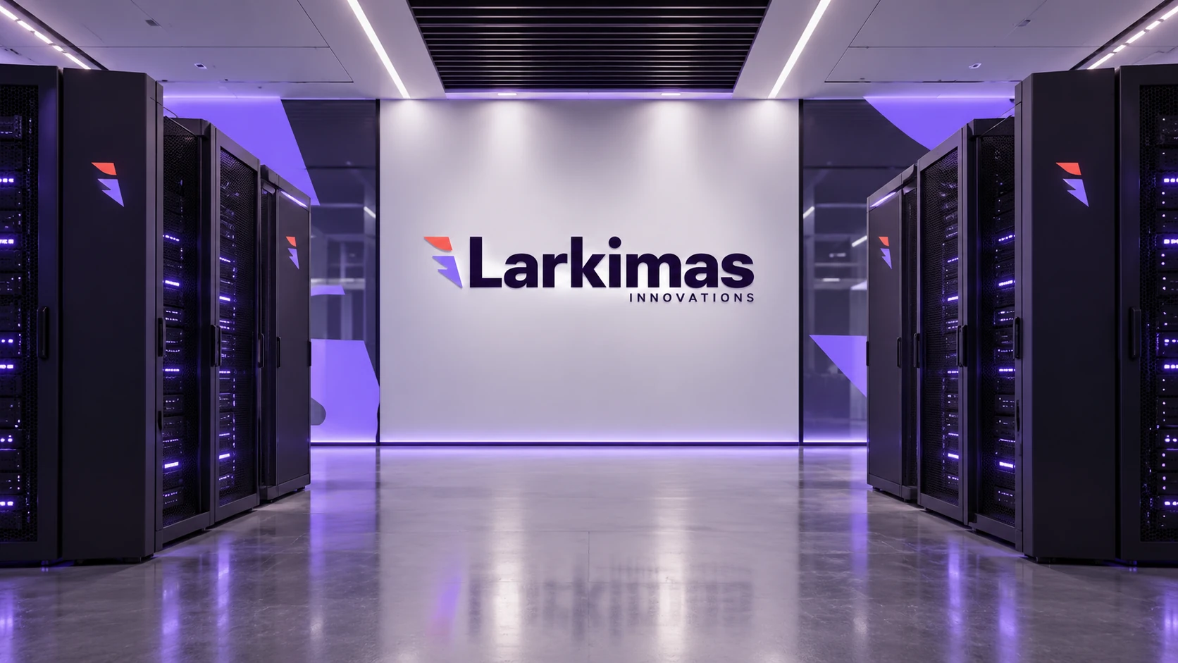
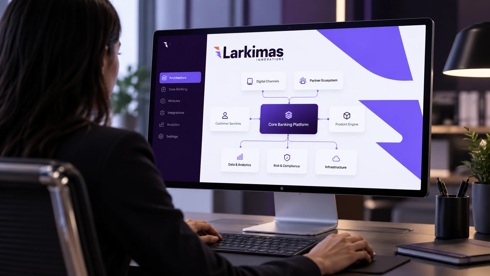
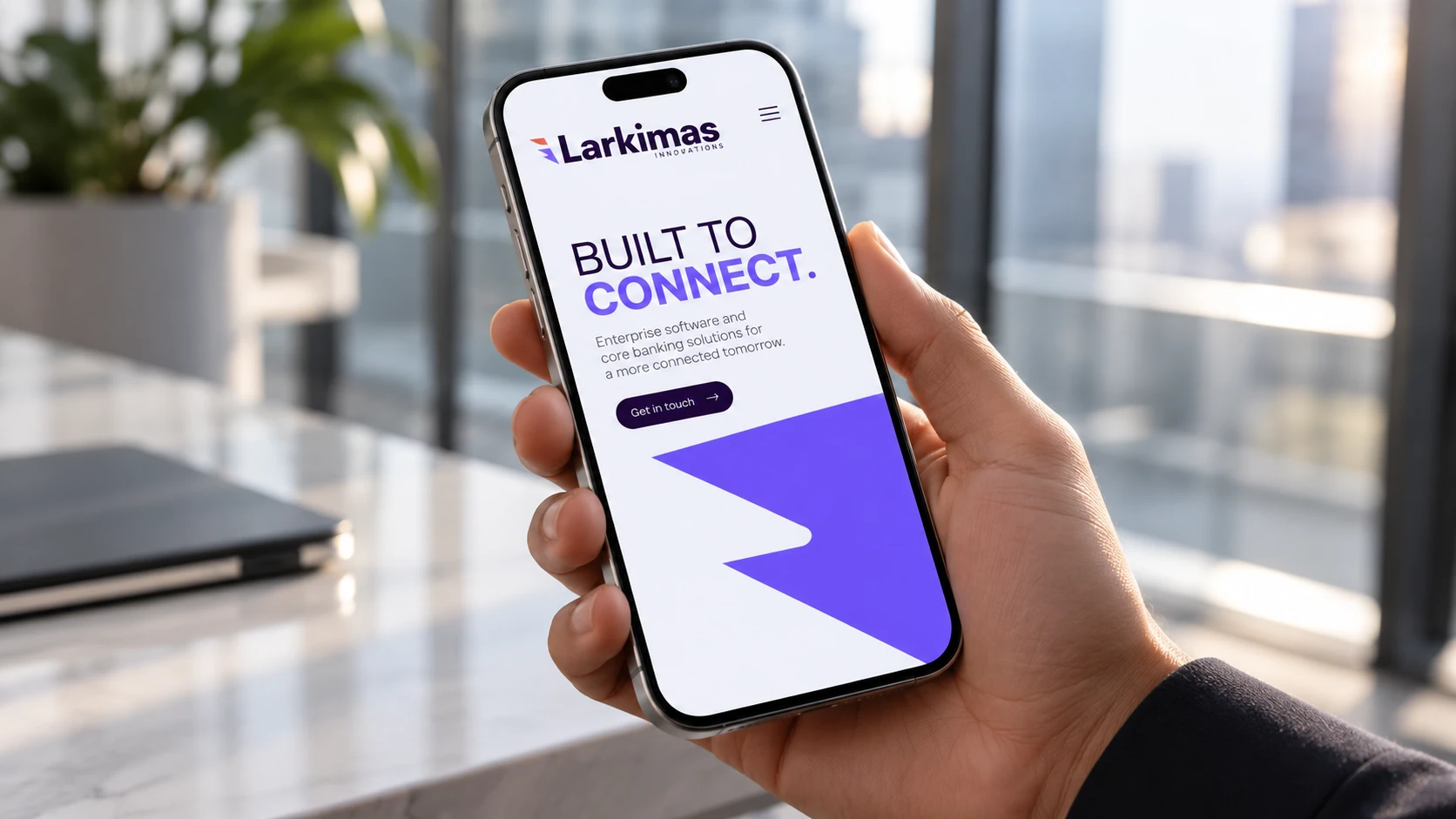
A software company’s identity has to remain coherent in a digital context. The new studies explore a company website, a mobile presentation and an engineering workspace, using the brand’s hierarchy, graphic rhythm and color relationships.
The website and screen imagery are illustrative concept applications, not supplied production interfaces or evidence of a new core banking product. Similarly, the technical-room study communicates an enterprise setting without claiming ownership of infrastructure, certifications or a deployed facility.
12 · A consistent public presence
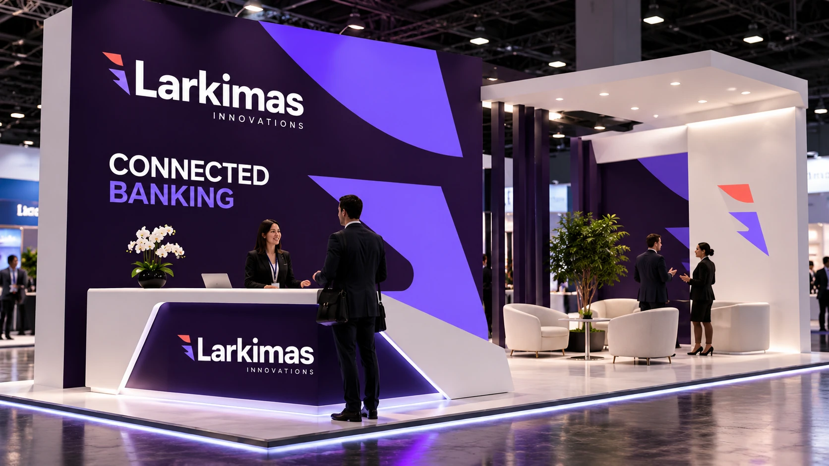
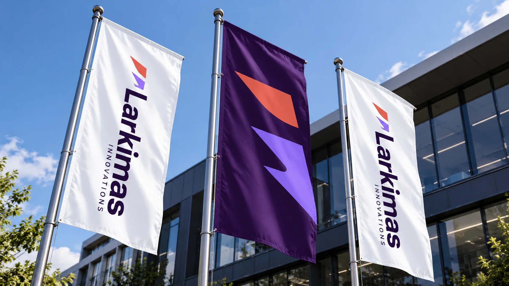
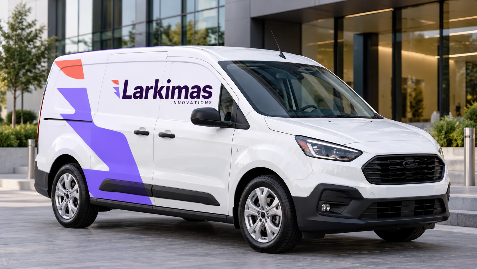
An exhibition stand, exterior flag or city campaign has a different viewing distance and reading time from a proposal. The system adapts through larger shapes, shorter messages and more decisive contrast, while keeping the original signature recognizable.
The service-vehicle study adds a practical touchpoint for an implementation team. These applications are creative extensions of the visual identity, not a claim about an existing fleet, campaign or event appearance.
13 · Designed to stay coherent
The result is a documented identity with a clear symbol, bilingual signatures, a defined palette, typography and an expandable graphic language. The new visualizations explore how that foundation can connect architecture, workplace culture, business communication and digital presentation.
A practical rollout would check logo reproduction, contrast, bilingual hierarchy, sign legibility and template consistency across real production conditions. The case study demonstrates a design system and proposed applications; it makes no claim of measured business impact or completed architectural delivery.
Use the original logo artwork, proportions and approved variants.
Keep color, typography and graphic scale consistent across touchpoints.
Test real materials, lighting, print and screen conditions before rollout.
Visual identity & art direction · Alireza Jelodar
Original identity guideline · May 2024
AI-generated concept applications · Architectural, workplace, print and digital studies
Screen and architectural visualizations illustrate proposed applications of the supplied brand identity.